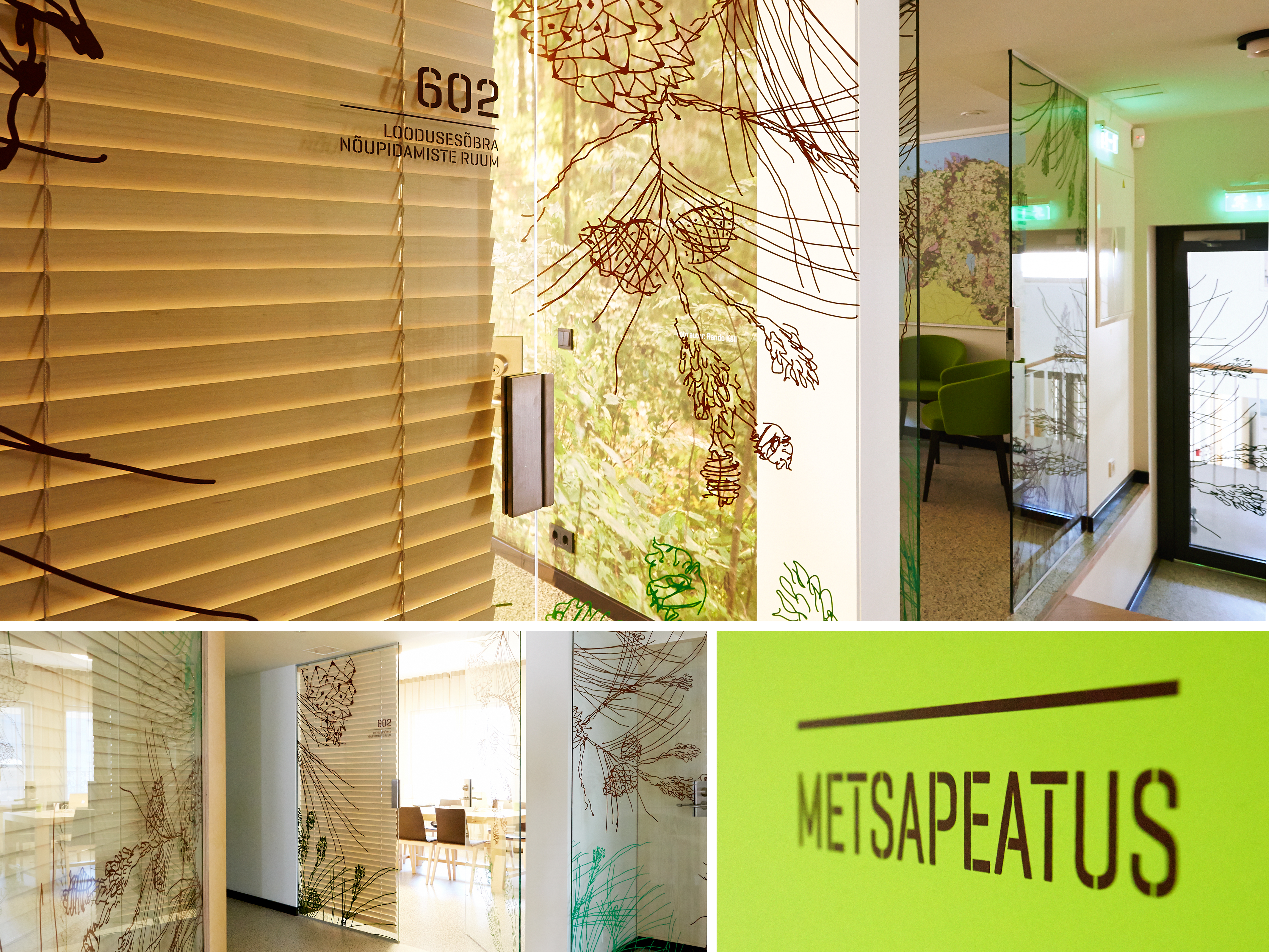
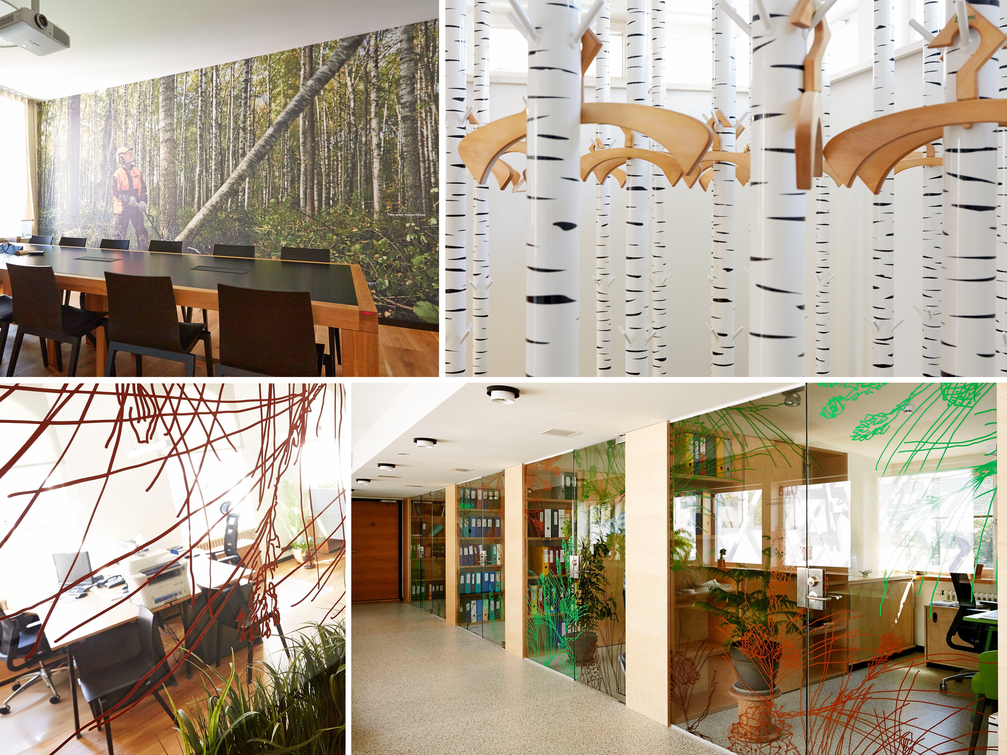
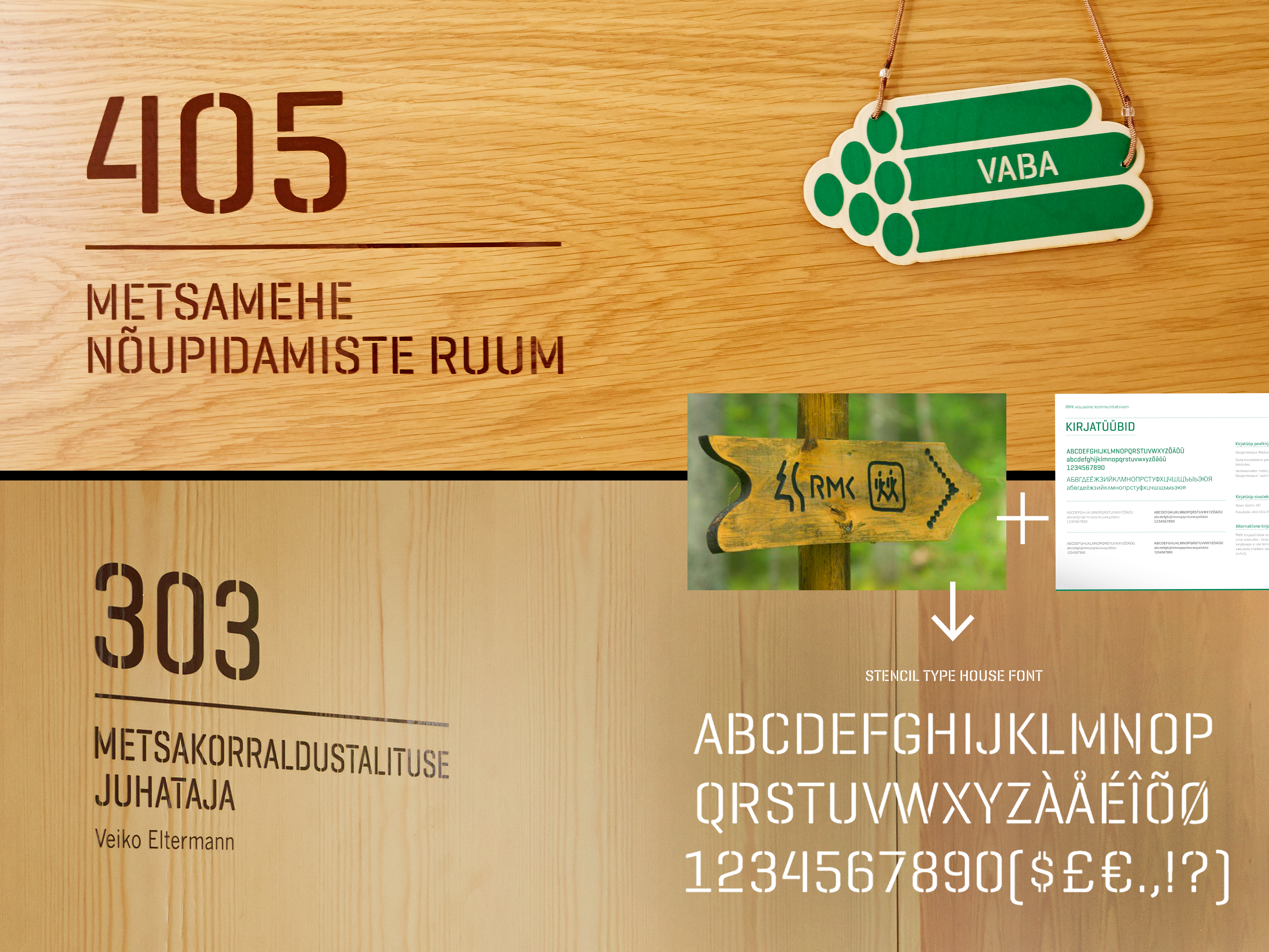
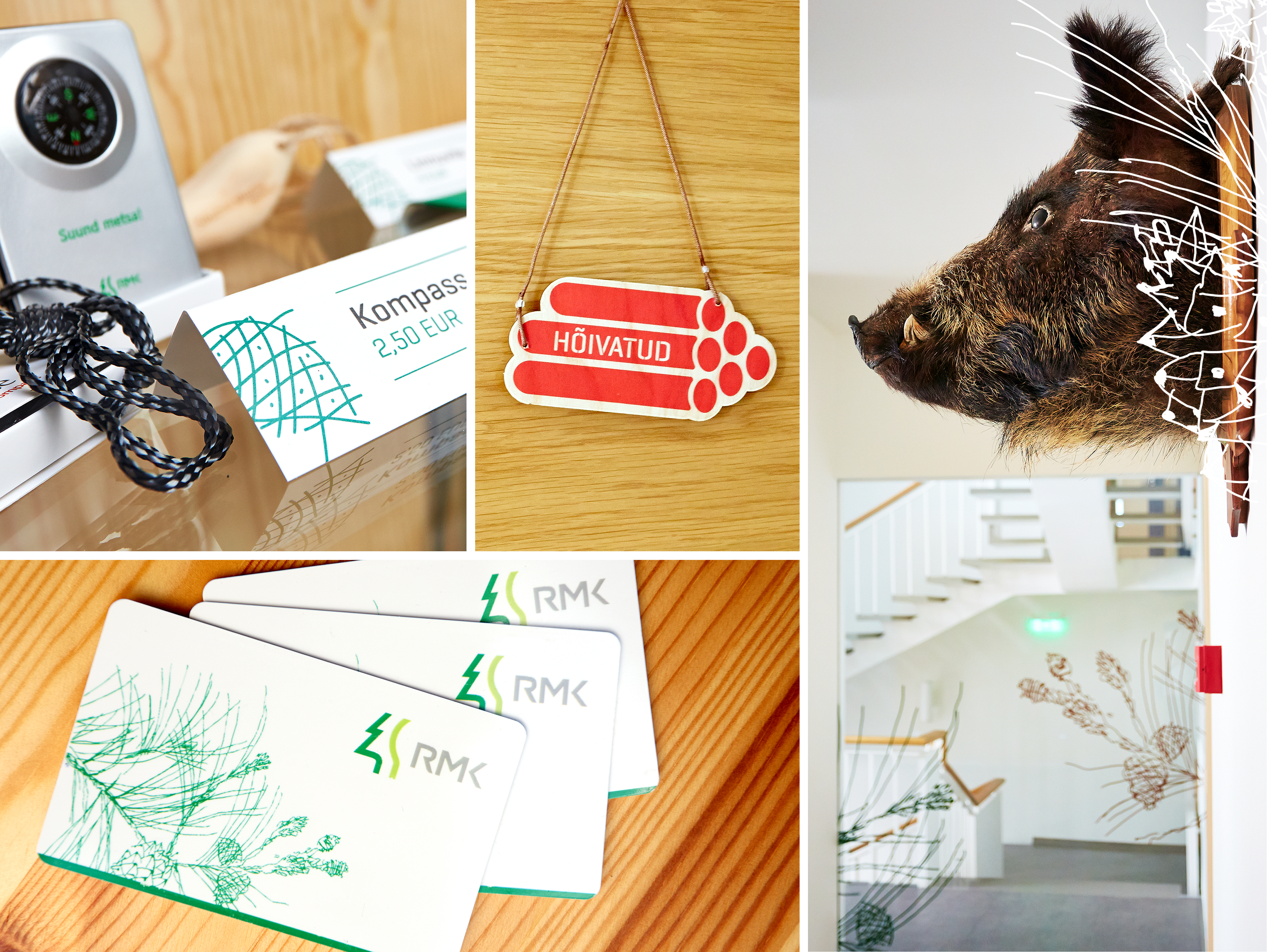
The identity of the RMK (the State Forest Management Centre) headquarters grew out of the corporate design of the company, the fresh ideas of interior designers imitating nature, and the forest itself.
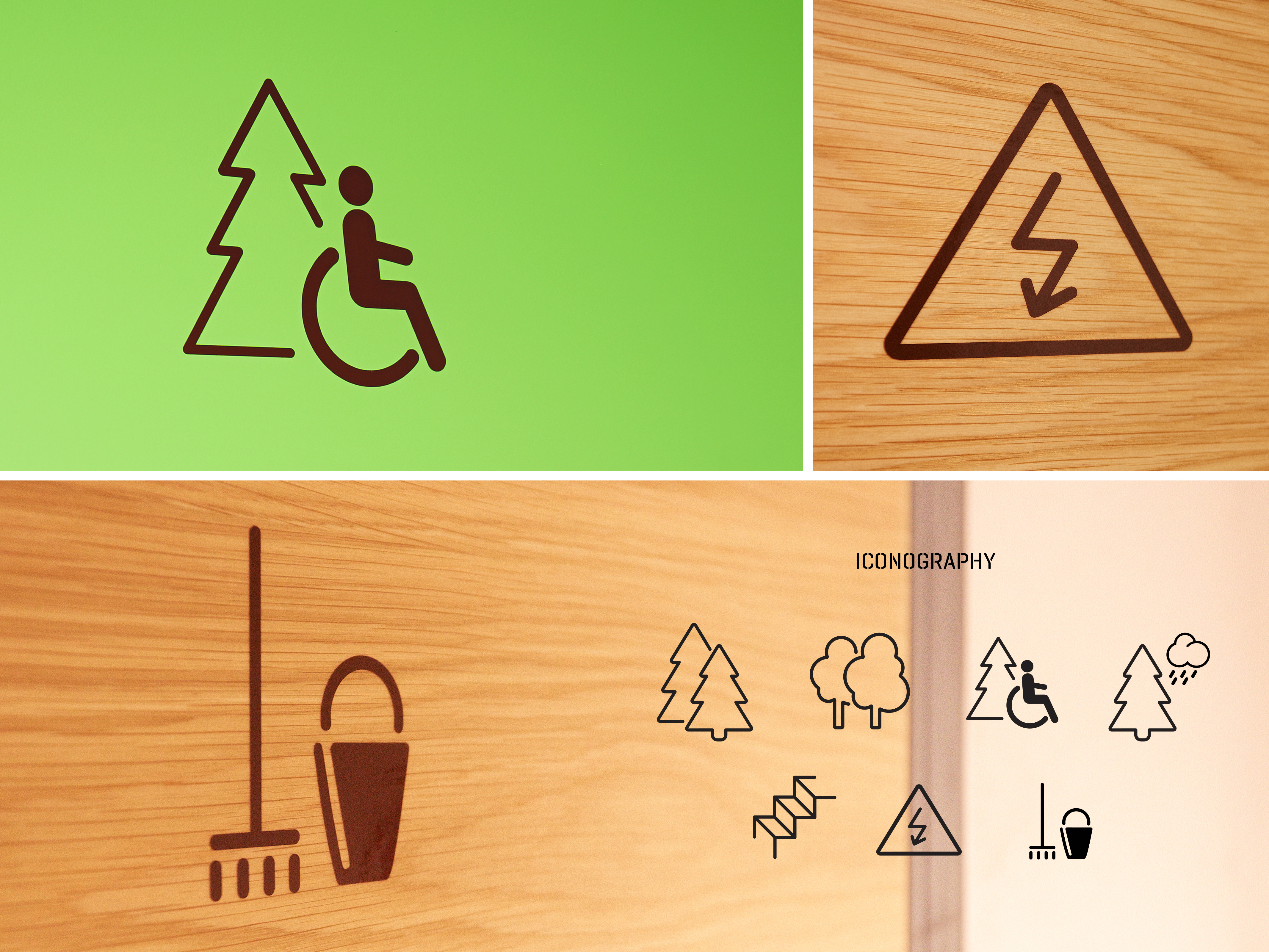
The goal was to create a delicate system supporting the environment, something visible and simple, but not dominating. Both the fonts and the icons were developed based on a vision of the building as an exciting hiking trail while also not forgetting the main function of RMK – managing forests.
